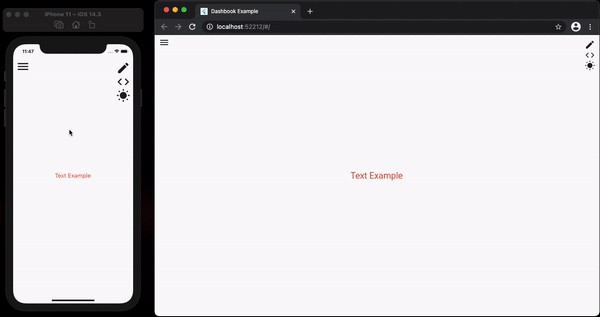
Dashbook is a powerful UI development tool for Flutter, providing a dedicated environment for developing and showcasing project widgets. Heavily inspired by Storybook, Dashbook offers a familiar experience for developers already accustomed to that platform. This guide explores Dashbook’s features, functionalities, and how to leverage it for efficient Flutter UI development.
Getting Started with Dashbook
Integrating Dashbook into your Flutter project is straightforward. Begin by adding the dependency to your pubspec.yaml file:
flutter pub add dashbookAlternatively, if you’re using Mason, a dashbook_gallery brick is available on brickhub.dev to quickly generate a basic gallery.
Dashbook organizes widgets into “Stories” and their variations into “Chapters.” A simple example illustrates its usage:
import 'package:flutter/material.dart';
import 'package:dashbook/dashbook.dart';

void main() {
  final dashbook = Dashbook();

  dashbook.storiesOf('Text')
    .decorator(CenterDecorator())
    .add('default', (ctx) {
      return Text(
        ctx.textProperty("text", "Text Example"),
        textAlign: ctx.listProperty("text align", TextAlign.center, TextAlign.values),
        // ... other properties
      );
  });

  runApp(dashbook);
}
dashbook_13
Interacting with Widgets: Actions in Dashbook
Dashbook facilitates user interaction with widgets through “Actions.” This feature enables calling methods directly from the UI, beneficial for components like dialogs that require user triggers.
dashbook.storiesOf('CustomDialog')
    .add('default', (ctx) {
      ctx.action('Open dialog', (context) {
        showDialog(
          context: context,
          builder: (_) => CustomDialog(),
      );
    });
    return SizedBox();
 });
Providing Context: Example Information
To enhance clarity and guide users, Dashbook allows adding informational text to examples. The info parameter within the add method serves this purpose:
dashbook.storiesOf('CustomDialog')
  .add(
    'default',
     (ctx) { //... },
    info: 'Use the action button to show the dialog.',
    pinInfo: true, // to display the info directly
);
Customizing the View: Preview Area
Dashbook offers control over the preview area. The usePreviewSafeArea parameter in the Dashbook constructor determines whether the preview occupies the entire screen or provides a safe area, preventing control icons from overlapping the example.
Theme Management in Dashbook
Dashbook provides flexible theme management, ensuring seamless integration with your app’s styling.
Single Theme
Use the theme parameter in the Dashbook constructor:
final dashbook = Dashbook(theme: ThemeData());Dual Theme
For apps with light and dark themes, use the Dashbook.dualTheme constructor:
final dashbook = Dashbook.dualTheme(
  light: YourLightTheme(),
  dark: YourDarkTheme(),
);
Multiple Themes
For more than two themes, utilize the Dashbook.multiTheme constructor with a map of themes:
final dashbook = Dashbook.multiTheme(
  themes: {
    'theme1': Theme1(),
    'theme2': Theme2(),
   },
);
Streamlining Properties: Visibility Control
Dashbook allows conditional display of properties based on other property values, simplifying complex widget examples. The visibilityControlProperty achieves this:
ctx.colorProperty(
  'errorColor',
  const Color(0xFFCC6941),
   visibilityControlProperty: ControlProperty('type', MessageCardType.error),
),
Conclusion
Dashbook empowers Flutter developers with a comprehensive tool for building and showcasing UI components. Its intuitive interface, inspired by Storybook, coupled with features like Actions, informative context, theme management, and property visibility control, significantly streamlines the UI development workflow. Leveraging Dashbook enhances efficiency, improves collaboration, and ultimately leads to a better user experience.