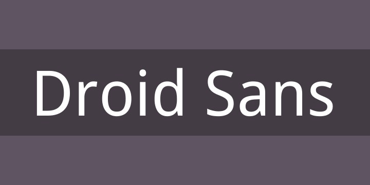
Droid Sans is a sans-serif typeface designed by Ascender Corporation for the Android operating system. Commissioned by Google, it has become synonymous with the Android experience. This guide delves into Droid Sans’ history, features, licensing, and how it shapes the visual identity of one of the world’s most popular mobile platforms.
Droid Sans: Origins and Design
Droid Sans was developed in 2007 to address the need for a legible and versatile font for Android’s user interface. Ascender Corporation, renowned for its expertise in digital typography, crafted a typeface optimized for screen readability. The design emphasizes clarity and efficiency, even at small sizes. This focus ensures that text remains clear and easy to read on various Android devices with differing screen resolutions.
The typeface boasts a humanist sans-serif design, meaning it draws inspiration from traditional calligraphy while maintaining a clean, modern appearance. This blend of classic and contemporary influences gives Droid Sans a distinct personality that is both familiar and innovative.
Droid Sans Family & Variants
The Droid Sans family includes several variants to cater to different typographic needs:
- Droid Sans Regular: The standard weight, suitable for body text and general use.
- Droid Sans Bold: A heavier weight used for headings, titles, and emphasis. There are also other weights, such as Droid Sans Mono, designed for code and programming environments.
This variety allows designers and developers to create visually appealing and hierarchical layouts within the Android ecosystem.
Licensing and Availability
Droid Sans is released under the Apache License, Version 2.0. This open-source license permits free use, modification, and distribution, even for commercial purposes. This permissive licensing has contributed significantly to Droid Sans’ widespread adoption beyond the Android platform. You can download the font files directly from Font Squirrel.  Droid Sans Font Download
The Apache License ensures that Droid Sans remains accessible to a broad audience, fostering its use in various design projects.
Droid Sans in the Digital Landscape
Droid Sans has become an integral part of the Android brand identity. Its consistent use throughout the operating system creates a cohesive and unified user experience. Beyond Android, its versatility and readability have led to its adoption in web design, graphic design, and even print media.
The typeface’s open-source nature and broad language support make it a valuable asset for designers working on international projects.
Conclusion
Droid Sans exemplifies the power of well-designed typography in shaping user experience. Its clarity, versatility, and open-source nature have solidified its place as a staple in the digital world. From Android devices to countless design projects, Droid Sans continues to contribute to a more legible and accessible online experience. Its impact extends beyond mere aesthetics; it embodies the spirit of open-source collaboration and the pursuit of universal readability in the digital age.